

Japanese Friendship Garden of Phoenix
Redesigning a cultural destination for confident visit planning
View Live PrototypeRole : UX Designer & Researcher
Timeline : 12 weeks
Platform : Desktop website
Scope : End-to-end : Audit > Research > Redesign
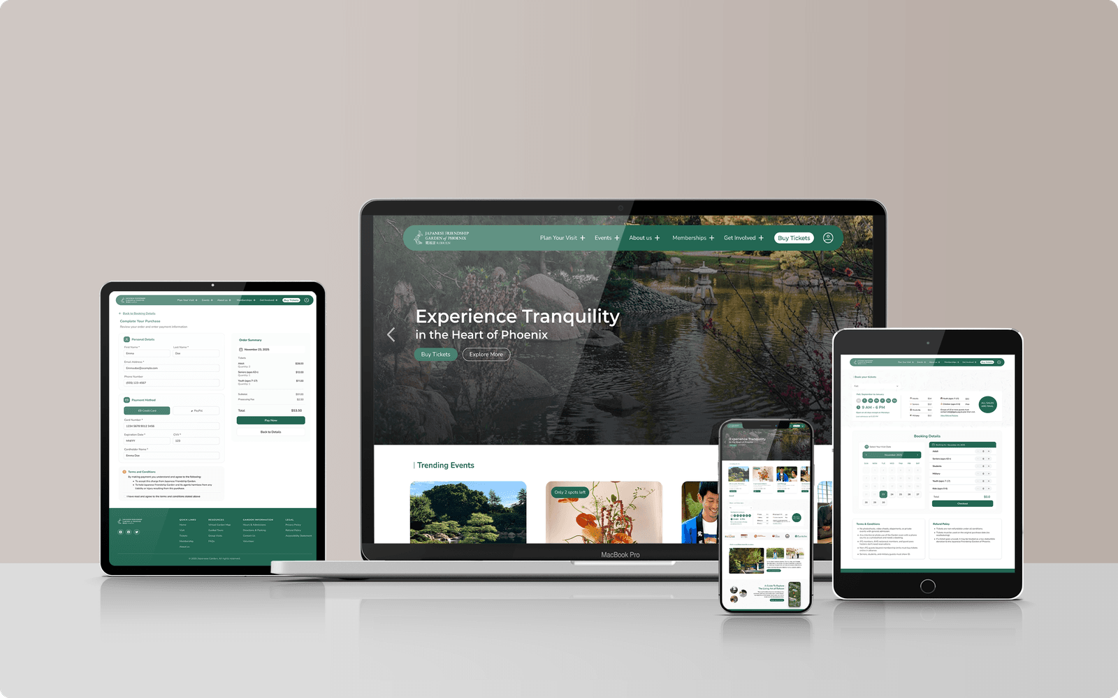
The Garden Website That Made Visit Planning Harder
The Japanese Friendship Garden of Phoenix website serves as a critical pre-visit tool. Visitors come to understand what the Garden offers, confirm hours and pricing, explore the space visually, and complete next-step actions like purchasing tickets or booking a photoshoot.
The existing experience placed unnecessary friction at each of these touchpoints. Ticket purchasing lacked prominence. Photoshoot booking was confusing. Practical information - parking, directions, hours required too much searching. The result was a site that eroded visitor confidence at exactly the moment it should have been building it.
Design Challenge
How might we redesign the Garden’s desktop website to reduce navigation friction, improve visibility of key visitor actions, and make visit planning more intuitive and confidence-building?
Home Page
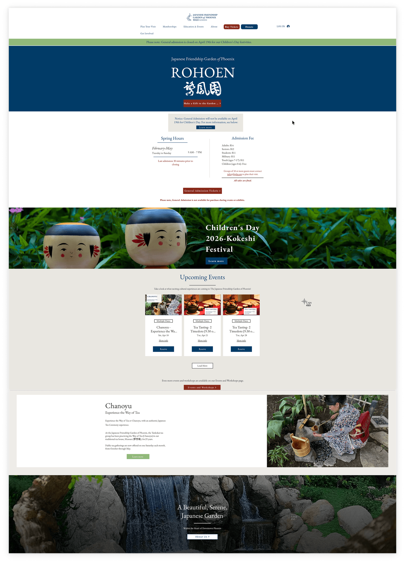
Booking Page
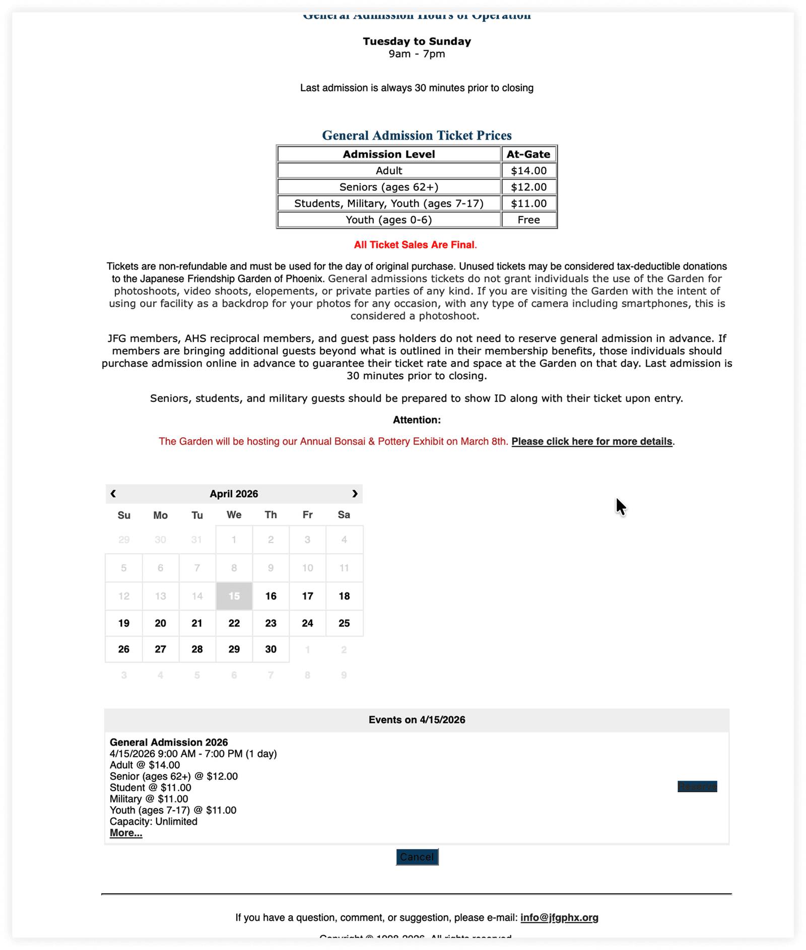
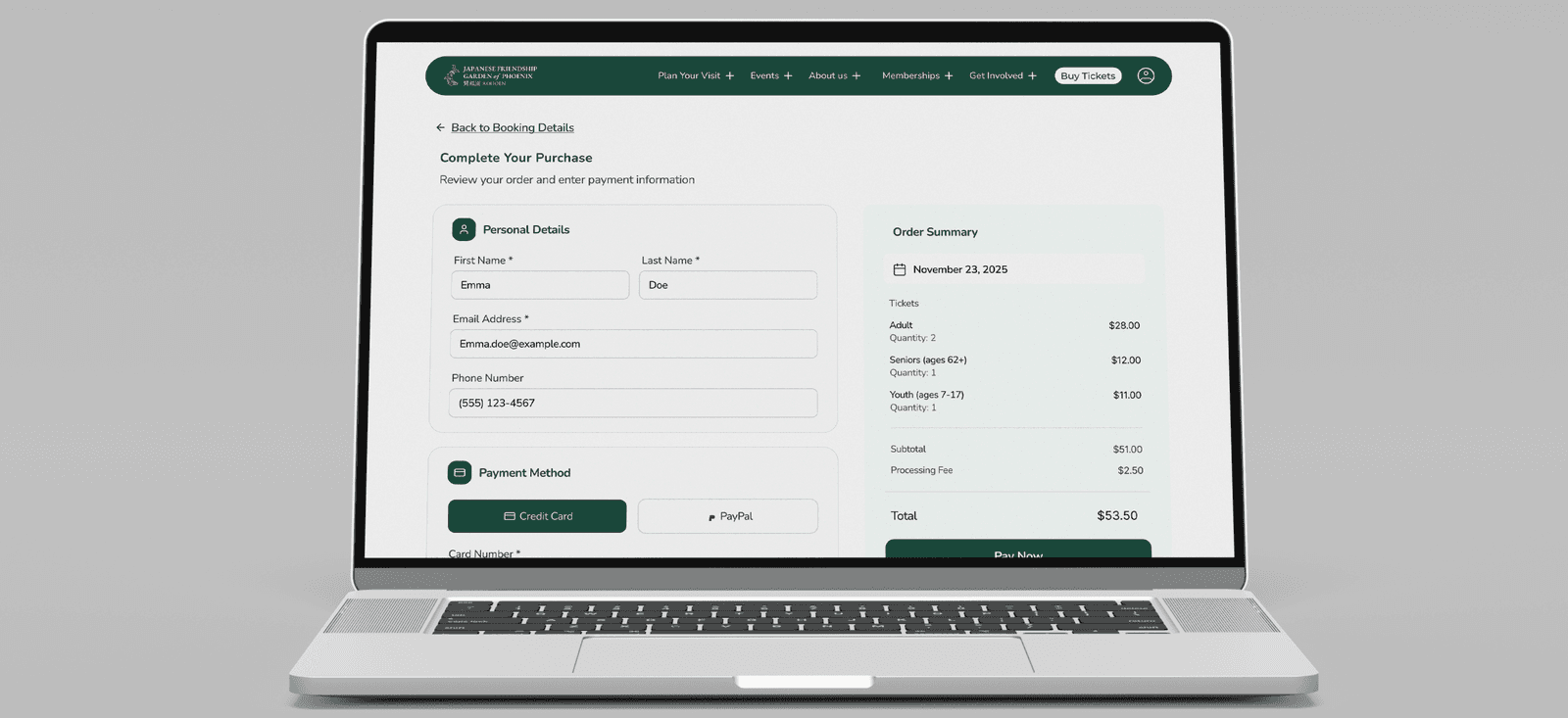
Checkout Page
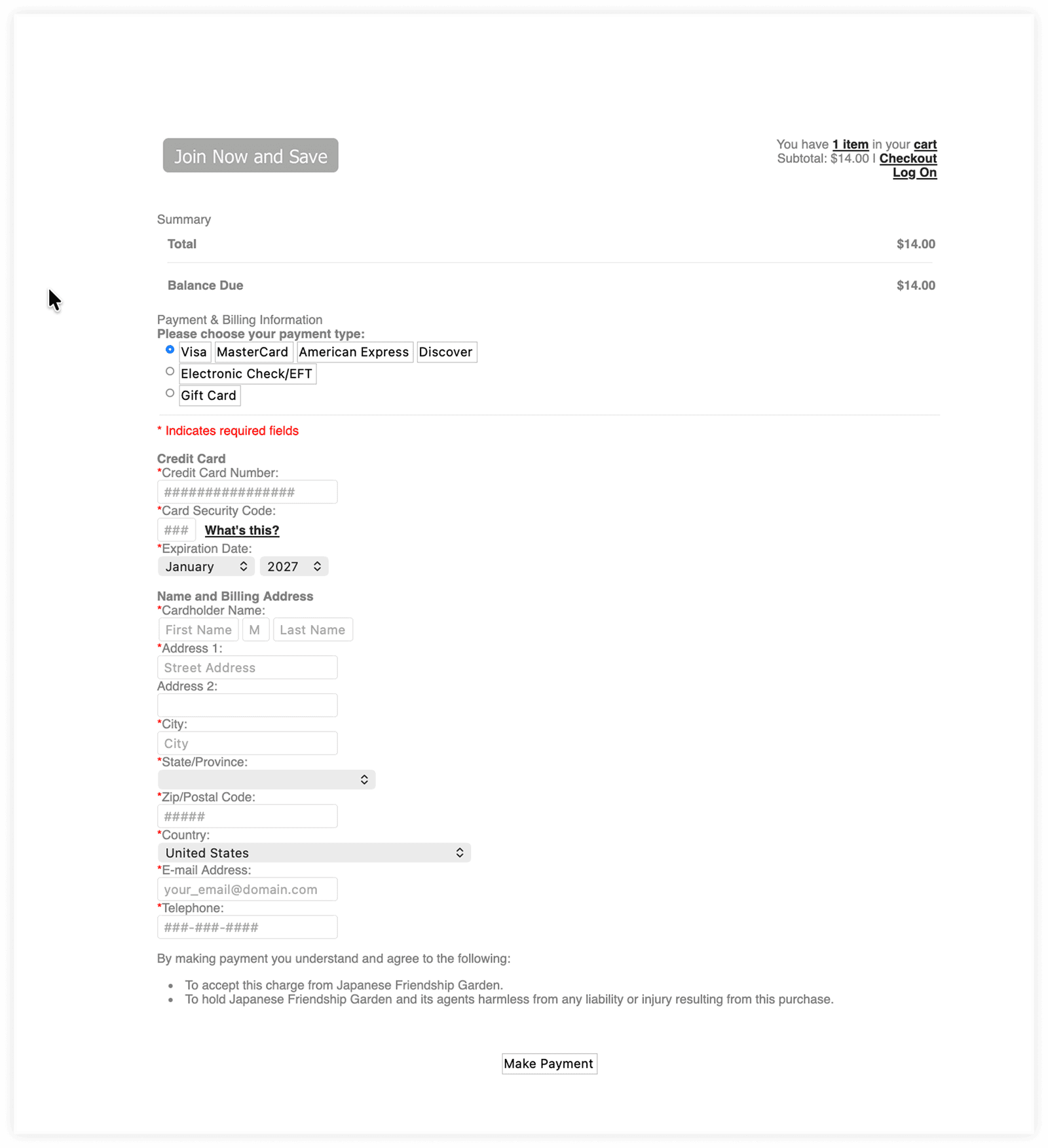
This was not a visual cleanup exercise. For many visitors, the website directly determines whether they feel confident enough to show up. When basic information is hard to find, users lose trust fast.
Lowered Confidence
Simple planning tasks felt unnecessarily difficult, weakening confidence from the start.
Reduced Efficiency
Dense layouts and weak hierarchy forced users to scan repeatedly, burning time on tasks that should resolve in seconds
Hurt Trust
When practical information is hard to find, it signals to visitors that the experience itself may not be well-managed.
A structured 12-week process, sequenced to build evidence
The project began with an experience audit of the current site, followed by a heuristic evaluation to surface usability problems before any users were involved. I then ran a survey with 23 respondents to validate and expand on those issues, used the findings to build personas and a journey map, and moved into moderated usability testing to observe real planning behavior. Design decisions followed directly from that evidence.
Discovery
01
Audit
Current experience assessment
Evalution
02
Heuristic Evaluation
Content, accessibility & heuristics review
Research
03
Survey
Quantitative user research at scale
Synthesis
04
Persona + Journey Map
User archetypes & end-to-end flows
Validation
05
Usability Testing
5-7 moderated participant sessions
Output
06
Redesign
High-fidelity mockups & specs
The most severe problems clustered around four areas, identified through heuristic evaluation and confirmed in testing. These were not isolated visual issues they pointed to deeper information architecture and prioritization failures.
01
Visibility of System Status
Primary actions like ticket purchasing lacked prominence. Users couldn't identify where to take next steps without hunting.
High Severity02
Match With User Mental Models
Navigation labels and content structure didn't align with how visitors thought about planning a trip, parking, hours, and photoshoots were buried.
High Severity03
User Control & Freedom
Booking flows lacked clear steps and pricing, making users unsure how to proceed or what they were committing to.
Medium Severity04
Aesthetic & Minimalist Design
Dense layouts and weak content prioritization reduced scannability across the site, slowing users at every stage of the planning funnel.
Medium SeverityVisitors came with practical goals. The site made those goals hard.
Survey research confirmed that users approached the site as a planning tool, not a browsing experience. They needed quick answers to hours, admission pricing, parking, and booking logistics and they made decisions about whether to visit based on how efficiently those answers appeared.
Ticket purchasing was the highest-priority action. Strong visuals influenced the decision to visit. And one behavioral signal stood out: 91% of respondents primarily browse cultural attraction websites on smartphones reinforcing the need for clearer hierarchy and faster access to core information, regardless of device.
Visual Content
16
respondents emphasized the importance of strong visuals such as photos and videos.
Navigation Issues
15
respondents reported poor navigation on garden website.
Ticket Purchasing
13
respondents expect fast, simple ticket-purchasing experiences.
Critical Finding
91% (21 out of 23 users) browse cultural attraction websites primarily on smartphones.
A first-time visitor who needs confidence before they commit.
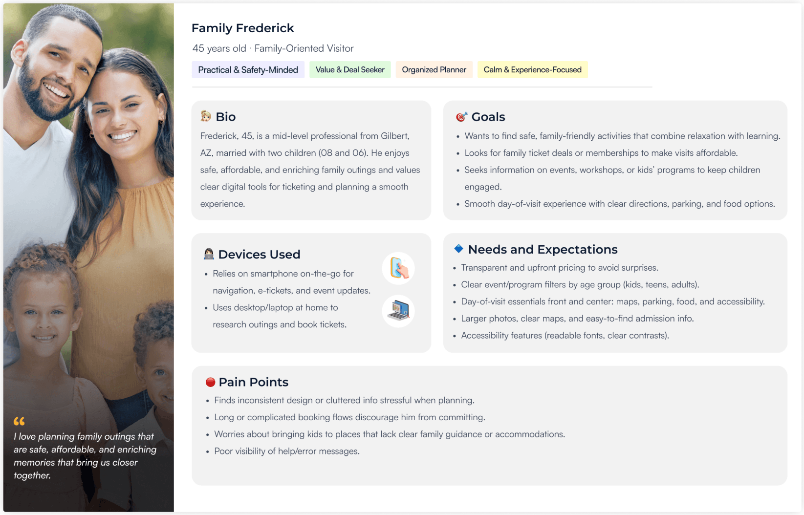
The primary user for this redesign was a first-time or casual visitor using the website as a planning tool. This user wanted to quickly understand what the Garden offers, confirm it matched their interests, determine cost, and take next-step actions without confusion.
Their expectations centered on clear navigation, trustworthy logistical information, strong visuals, and low-friction access to tickets and policies. When those expectations weren’t met, they didn’t dig deeper they lost confidence.
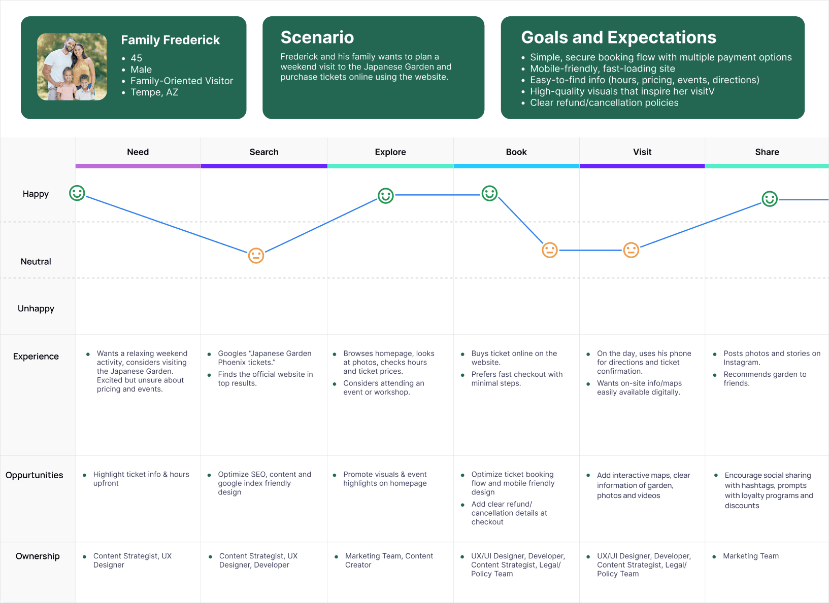
Journey mapping and usability testing identified three repeated friction points : all occurring at the moments where visitor confidence was most critical.
Initial Planning & Information Discovery
Users had to scan excessively to find basic answers about the Garden. Weak hierarchy and dense layouts prevented fast orientation for first-time visitors.
Locating Parking & Visit Logistics
Parking and directional information created significant uncertainty before visits. The data clearly showed that the problem was serious and needs attention.
Understanding Photoshoot Booking & Pricing
Unclear information about pricing, inclusions, and where to begin caused backtracking and hesitation. Users couldn't build confidence in the booking flow.
The data confirmed what the audit suggested and made prioritization clear
I conducted moderated usability testing using realistic visitor tasks tied to planning and booking behavior. Participants attempted core tasks while I tracked completion, time on task, navigation paths, and visible hesitation. Some tasks performed well. The hardest tasks exposed the sharpest redesign priorities.
Parking Info
50%
Task success rate : the clearest failure in the entire audit
Parking Info
94.78 s
Average time on task : a task that should resolve in under 10 seconds
Photoshoot Booking
85.7 s
Average time to begin booking : slowed by missing pricing and unclear entry points
Task
Outcome
Signal
Find hours & admission
Retain structure, refine hierarchy
Locate membership info
Preserve, improve discoverability
Find upcoming events
Well-placed, keep prominence
Locate parking directions
Highest priority redesign target
Begin photoshoot booking
Flow and pricing clarity needed
Purchase tickets
CTA visibility and hierarchy gap
Five priorities. One lens: reduce uncertainty for first-time visitors.
Based on the audit, research, and testing, I identified five redesign priorities ordered by impact, not equal weight. These ensured the redesign addressed the highest-friction tasks first rather than treating every part of the experience equally.
The design strategy translated these priorities into three core moves: restructuring around visitor intent, simplifying high-intent flows, and using visual content more strategically so imagery supported exploration without competing with task completion.
Navigation Clarity
Labels and structure must match how visitors think about planning a trip
Action Visibility
Ticket purchasing and key CTAs need prominent, unambiguous placement
Pricing & Booking Clarity
Photoshoot booking flow needs step structure and upfront pricing
Content Discoverability
Visual and cultural content must support exploration without blocking task paths
Visit Planning Support
Parking, hours, and logistics grouped so users can plan without hunting
Structure before style, validating hierarchy before committing to interface
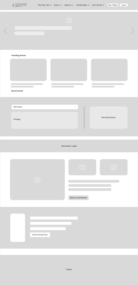
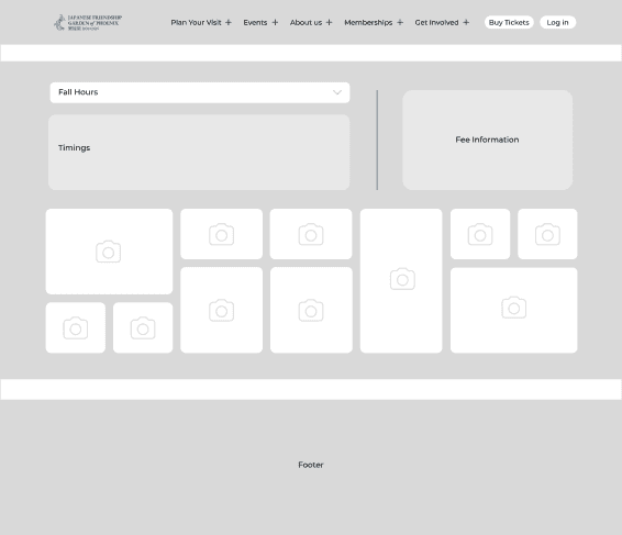
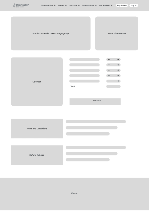
Low-fidelity wireframes focused on page hierarchy, CTA placement, layout flow, and content prioritization across the homepage, hours and admission page, and booking page. The goal was to test organization and usability before committing to visual decisions.
Home Page
Hours & Admission Page
Booking Page
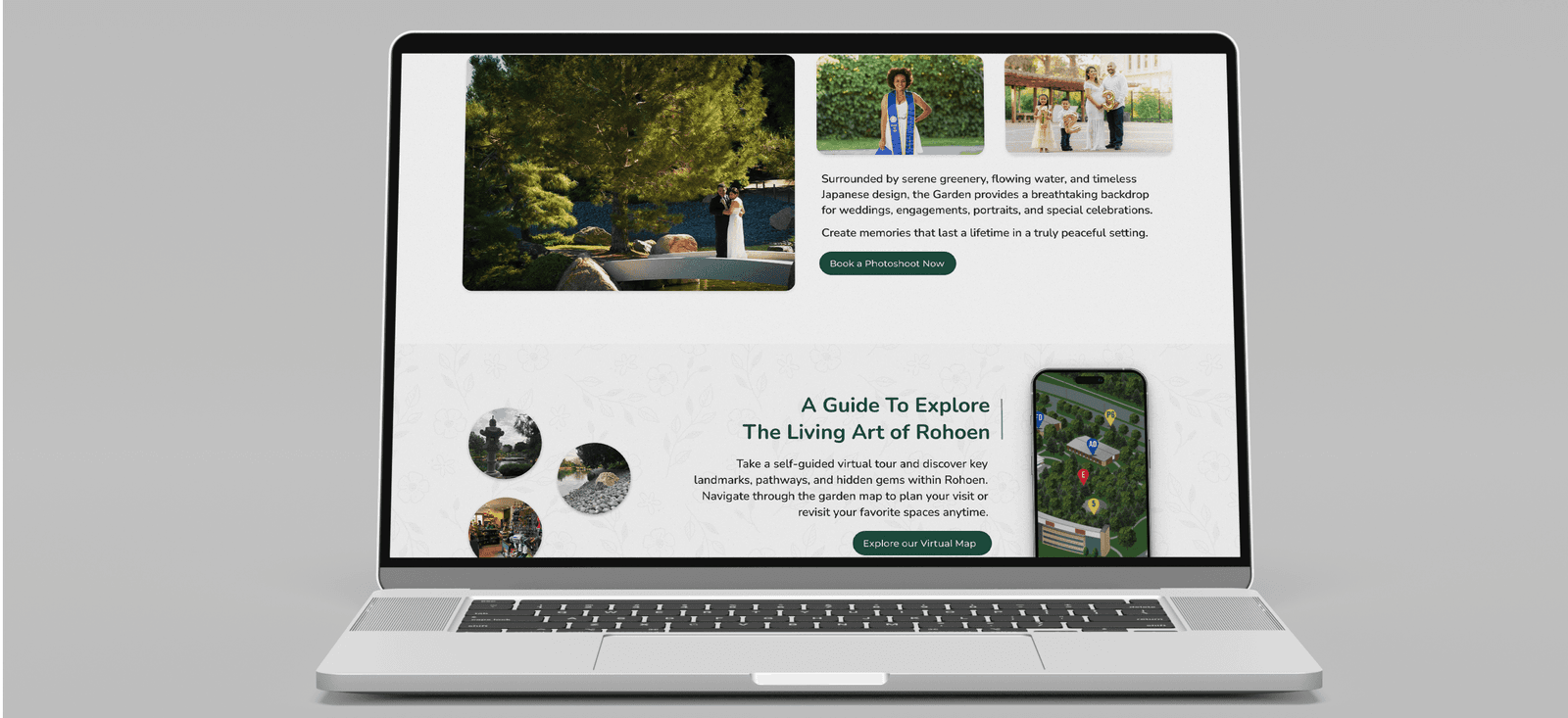
An Experience Built Around Visitor Intent.
The final desktop redesign focused on the most critical issues identified in research and testing. The solution improved task clarity and visit-planning confidence while preserving the Garden’s calm, visually rich identity. The redesign was not intended to reinvent the brand it was designed to earn visitor trust through better structure.
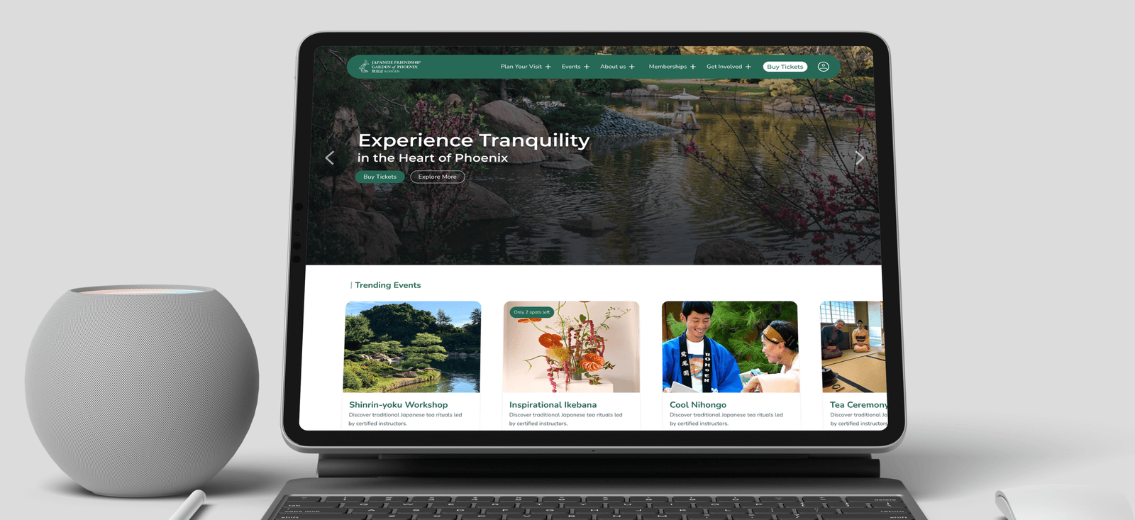
Homepage : Clearer Navigation & Stronger Entry Points
The homepage was redesigned to function as a stronger orientation layer for first-time visitors. Navigation clarity was improved, hierarchy adjusted, and key visitor actions surfaced more intentionally. "Book Photoshoot" and "Virtual Map" were given visible placement to reduce hunting behavior.
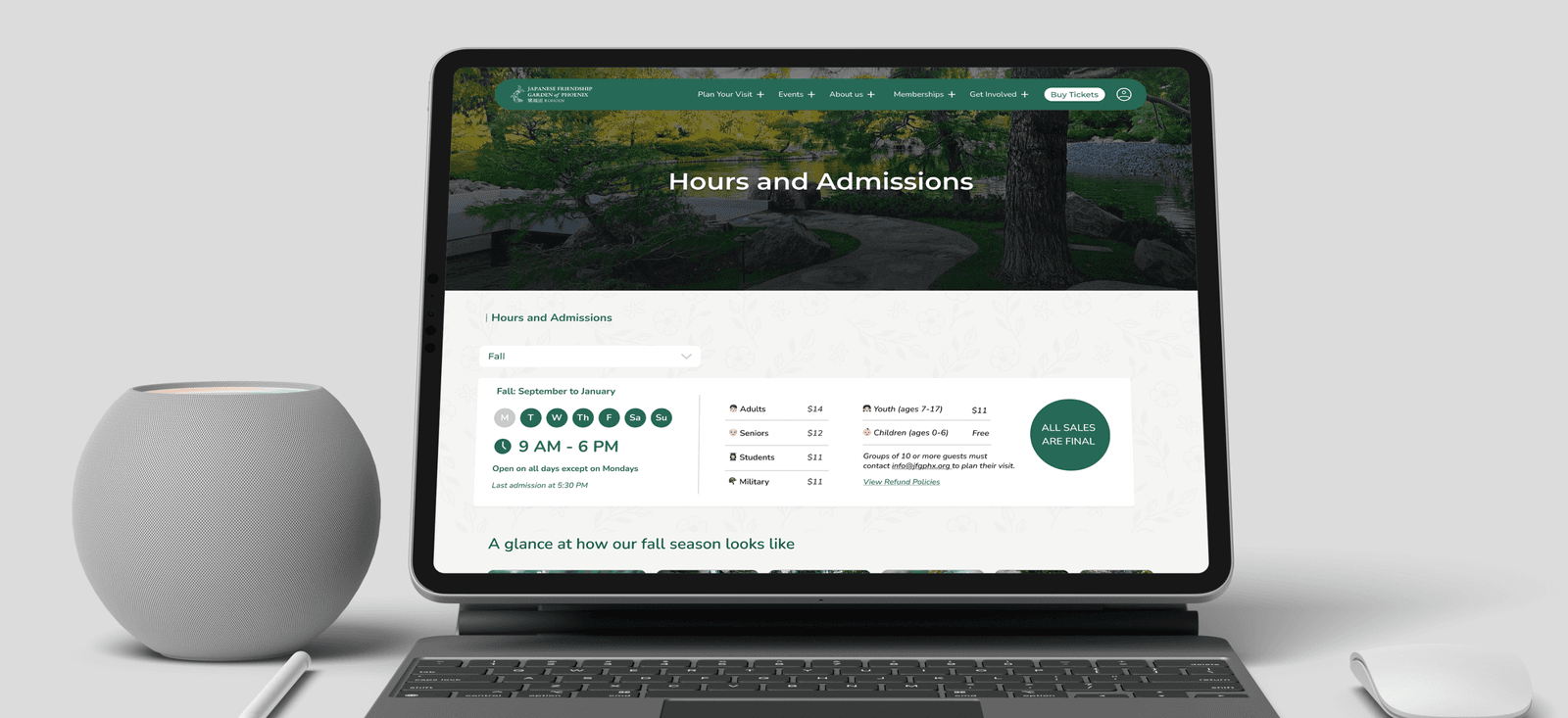
Hours & Admission : Better Planning Clarity with Visual Support
The Hours & Admission page was redesigned to make operational information easier to scan. Improved grouping and structure let users interpret hours, admission details, and planning information with less effort. A gallery section was added to turn the page into both an information layer and a reassurance layer.
Booking Flow : Cleaner Hierarchy & Lower Cognitive Load
The booking page was redesigned to improve clarity in a high-intent flow. A reworked layout created cleaner information hierarchy, simplified user input, and made booking details easier to understand at a glance directly addressing the hesitation and uncertainty observed in testing.
NAVIGATION
Restructured around visitor intent so planning-related information and next-step actions resolve faster, with less scanning.
ACTION VISIBILITY
Primary CTAs ticket purchasing and photoshoot booking elevated to prominent, unambiguous positions throughout the experience.
BOOKING CLARITY
Pricing, inclusions, and step structure clarified so users can move forward without hesitation or backtracking.
VISIT PLANNING
Operational information hours, parking, directions grouped and surfaced so the site fulfills its role as a confidence-building planning tool.
Destination websites succeed when they reduce uncertainty, not just when they look attractive. Visitors come with practical questions and make trust decisions quickly. The other lesson: a strong case study depends on synthesis, not volume. The work is most persuasive when it connects the clearest evidence to the most important decisions not when it demonstrates every method used.
Next Project
Infinity ProductionsCoffee? Let's Build Something Thoughtful.
I’m open to conversations about product design, UX strategy, AI experiences, and teams building
work that genuinely helps people.
Radhika Sunil Autade
Phoenix, Arizona
© 2026 Radhika Sunil Autade. All rights reserved.