

Smart Driver Assist
Designing supervised highway driving for clearer control, confidence, and safer handoffs
View Live PrototypeRoleUX Designer
Timeline12 weeks
PlatformDesktop website
ScopeResearch Synthesis > UX Strategy > Interface Design
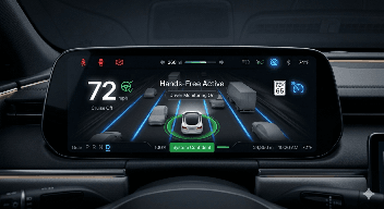
The Hands-Free Driving Experience That Made Control Feel Unclear
Level 2 hands-free highway driving systems are not self-driving systems. The driver is still responsible for watching the road and taking control when needed. The problem is that many current systems do not communicate their state clearly enough. Drivers can often tell whether the system is active or inactive, but they struggle to understand how confident the system is, when conditions are becoming unstable, or why the system suddenly gives control back. That creates a dangerous UX gap.
When system confidence drops, the driver needs to know early. When takeover may be required, the driver needs time to prepare. When the system disengages, the driver needs to understand why. This project focused on redesigning the communication model for supervised highway automation so drivers can better understand system status, anticipate handoffs, and maintain appropriate trust.
Design Challenge
How might we redesign the Level 2 highway driving interface so drivers can clearly understand system status, confidence, takeover urgency, and disengagement reasons without increasing distraction or overtrust?
The current experience creates friction across the most critical driving moments:
01
Active Driving State
The system may show that hands-free driving is active, but it does not clearly communicate whether the system is highly confident or operating under uncertainty.
02
Takeover Moment
Alerts often feel reactive. Drivers receive a warning when intervention is already urgent instead of receiving gradual preparation cues.
03
Disengagement Moment
When the system stops assisting, drivers often do not receive a clear explanation of why it happened.
This was not a visual design exercise. In supervised driving, unclear system communication can directly affect driver readiness, trust, and safety.
Mode Confusion
Drivers may not instantly understand whether they are in control, whether the system is assisting, or whether assistance is degrading.
Overtrust
When the system works well most of the time, drivers may assume it can handle more than it actually can.
Delayed Takeover
If takeover warnings arrive too late, drivers may not have enough time to rebuild situational awareness.
Driver Monitoring Frustration
Attention alerts can feel annoying or poorly timed when they do not match driving context.
Low Disengagement Transparency
When the system disengages without explanation, drivers cannot learn the system's limits.
A Structured Research Process Focused On Safety-Critical Interaction
This case study was built through secondary research, competitive analysis, cognitive load review, and heuristic evaluation. The goal was not to prove final safety impact. The goal was to identify the main communication failures in supervised highway automation and translate them into a clearer interaction model.
Discovery
01
Public Safety Report Review
Automated driving incident patterns Mode confusion, overtrust & delayed intervention
Evalution
02
Human Factors Research
Driver behavior & automation trust Automation state interpretation, complacency & takeover demand
Research
03
Competitive Product Teardown
ADAS product comparison Tesla Autopilot, Ford BlueCruise
Synthesis
04
Cognitive Load Analysis
Information processing assessment Evaluated driver attention limits across driving states
Existing Systems Communicate Activity Better Than Uncertainty
I reviewed major Level 2 highway assistance systems, including Tesla Autopilot, Ford BlueCruise, and General Motors Super Cruise.
Each system has strengths:
- Tesla provides clear lane and vehicle visualization on the central display.
- Ford BlueCruise provides a recognizable hands free activation state and strong driver monitoring.
- GM Super Cruise uses a steering wheel light bar to communicate system state quickly.
But the competitive gap was consistent :
Current systems generally do not communicate graded confidence well. They often show whether automation is active or inactive, but not whether the system is becoming uncertain. They also tend to treat takeover as a reactive moment instead of a predictable transition. The opportunity was to move from binary status communication to a progressive state model.
The most critical issues were grouped into four key areas. These issues were found through competitive review, heuristic evaluation, driver survey results, and cognitive load analysis.
01
Visibility of System Status
Current systems show if automation is on or off, but not how confident or ready for takeover it is.
High Severity02
Error Prevention
Takeover alerts often occur too late and feel reactive.
High Severity03
Recognition Over Recall
Drivers must interpret abstract icons, tones, or status changes instead of receiving clear, intuitive cues.
Medium Severity04
Error Recovery
After disengagement, drivers often receive little explanation about what happened.
Medium SeverityThe most critical issues were grouped into four key areas. These issues were found through competitive review, heuristic evaluation, driver survey results, and cognitive load analysis.
Activation
Drivers need immediate confirmation that hands-free assistance is active and available.
Current Friction
Activation state can be understood, but confidence level remains unclear.
Design Need
Clear active state with persistent confidence visibility.
Stable Highway Driving
Drivers may relax too much when the system appears stable.
Current Friction
The system does not continuously remind drivers of uncertainty or limits.
Design Need
Subtle confidence feedback that maintains awareness without creating distraction.
Environmental Change
Lane ambiguity, sensor obstruction, highway exits, or complex traffic can reduce system reliability.
Current Friction
Drivers often do not know the system is becoming less confident.
Design Need
Early reduced-confidence state before takeover becomes urgent.
Takeover
Drivers need to re-engage quickly and safely.
Current Friction
Alerts can feel sudden, stressful, and poorly staged.
Design Need
Predictive takeover countdown with multimodal escalation.
Post-Disengagement
Drivers need to understand why assistance stopped.
Current Friction
Lack of explanation weakens trust and prevents learning.
Design Need
Lightweight post-event transparency screen.
Four Priorities. One Goal: Reduce Unsafe Ambiguity.
Based on the research, I defined four design priorities ordered by impact. The strategy was not to add more information everywhere. The strategy was to show the right information at the right moment with the right level of urgency.
System Confidence Visibility
Drivers need to understand whether the system is highly confident, reduced confidence, or near handoff.
Predictive Takeover Communication
Drivers need warning before intervention becomes urgent.
Context-Aware Driver Monitoring
Attention alerts should respond to driving complexity instead of using the same intensity in every situation.
Disengagement Transparency
Drivers need to know why the system stopped assisting.
If the system continuously displays confidence, predicts takeover needs, adapts driver monitoring to environmental complexity, and explains disengagement clearly, then drivers will be better prepared for control handoff and less likely to overtrust the system. This hypothesis would need validation through simulator testing, reaction-time measurement, and usability testing.
Structure Before Interface Detail
Before designing final screens, I defined the system architecture across the instrument cluster, HUD, and post-event explanation layer. The goal was to make each surface responsible for a specific type of information.
Instrument Cluster Screen Architecture :
Status Strip
Top Status Zone
Primary Driving Visualizations
Bottom Status Zone
Regulation/
ADAS Zone
Head-Up Display Layout and State Structure :
Hands Free Active
72mph
Cruise Off
Prepare toTake Control
Active State
Hands FreeInactive
72mph
Cruise Off
Prepare toTake Control
Inactive State
Designing Clearer Supervision For Uncertain Driving Moments.
The final design focuses on critical supervised driving moments where drivers need clear system feedback, early warnings, attention guidance, and post-event explanation. Instead of making automation feel fully smart or invisible, the interface makes its limits visible. The goal is to help drivers understand what the system is doing, when confidence is dropping, and when human control is required.
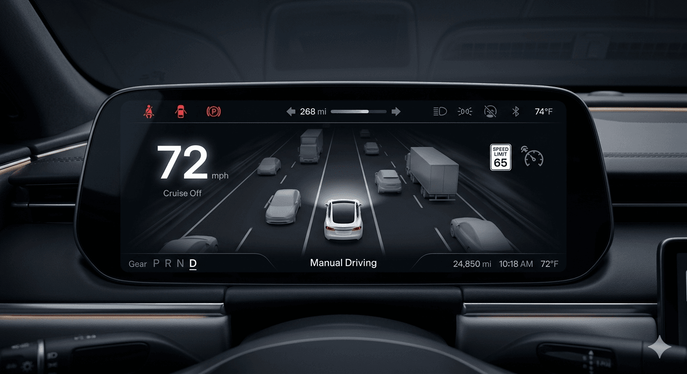
Manual Driving: Baseline System State
The manual driving screen establishes the default state before automation is active. It shows speed, cruise status, lane context, and road environment without adding unnecessary visual noise. This gives drivers a clean baseline so later automation states feel easier to compare.
Hands-Free Active: Clear Automation Confirmation
This screen shows when hands-free driving is active and the system is operating with high confidence. The blue lane glow, green confidence ring, and System Confident status make the automation state obvious without forcing the driver to read too much text.
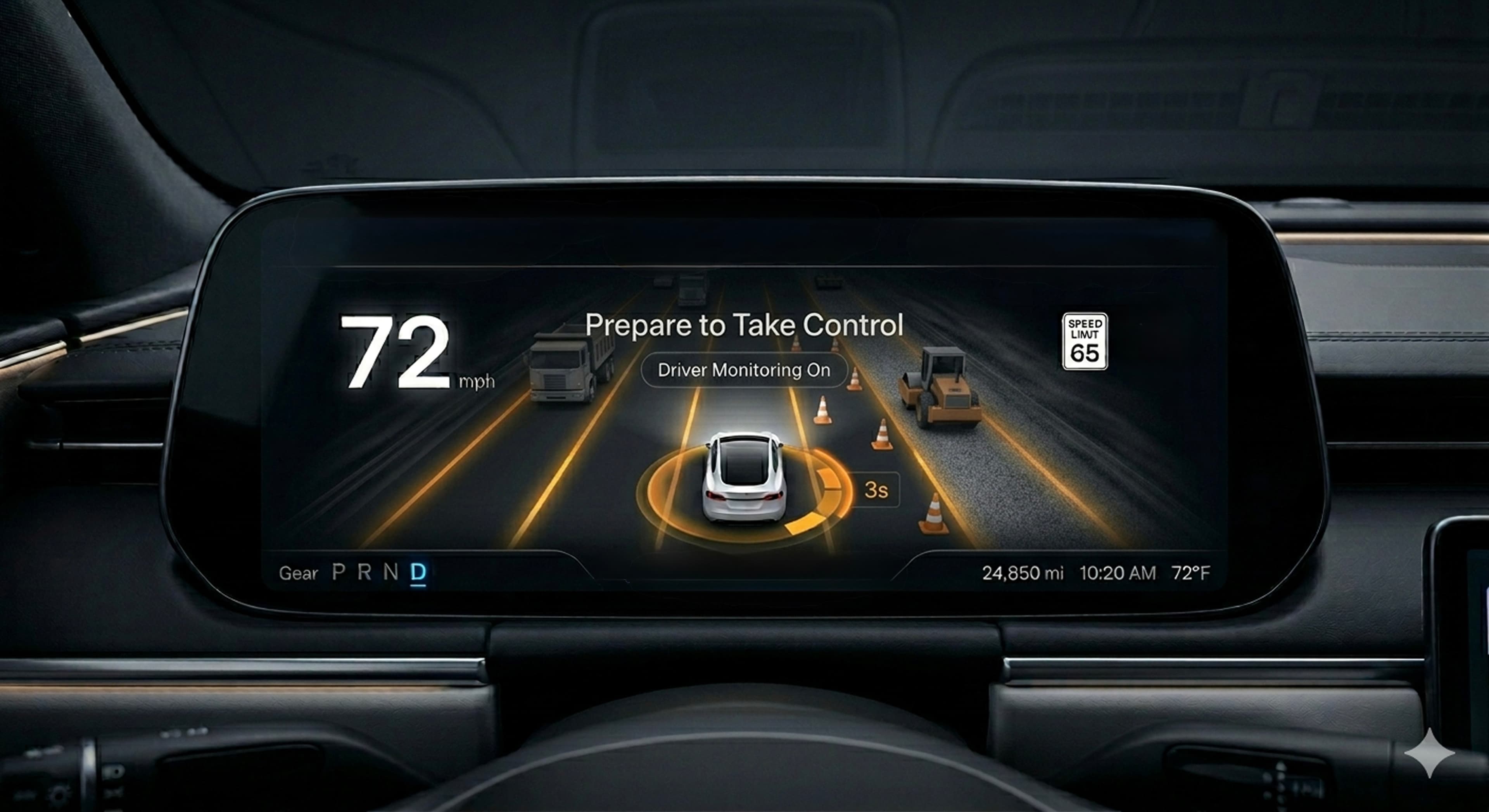
Prepare To Take Control: Predictive Warning
This screen turns a possible handoff into a staged transition. Instead of suddenly demanding control, the interface warns the driver that takeover may be needed soon. The orange state communicates urgency while still giving time to re-engage.
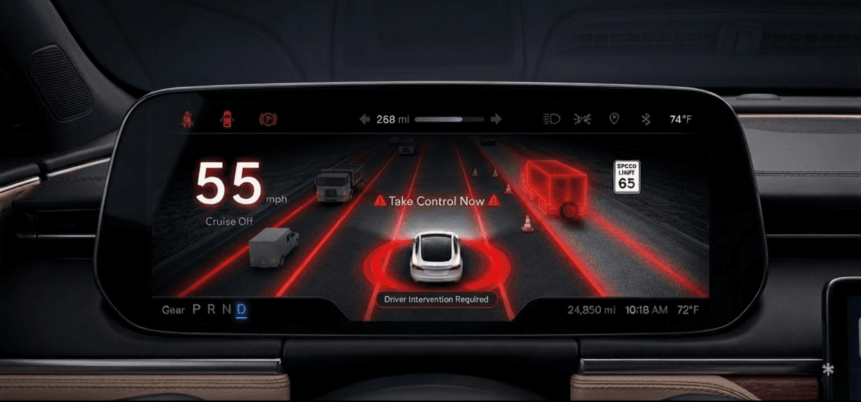
Take Control Now: Critical Intervention State
This screen communicates that driver action is required immediately. The red visual language, highlighted hazard, and Take Control Now message make the situation impossible to miss. This is the strongest escalation state in the system.
HUD Interface Screens: Minimal Critical Feedback
The HUD screens translate the same system states into a smaller, glanceable format. Instead of repeating the full dashboard interface, the HUD only shows the most important information: automation state, speed, confidence, and takeover status.

Designing Predictable Responses For Common Highway Failures
To make system behavior more predictable, I mapped common failure scenarios to specific interface responses.
| Failure Scenario | System Response | Driver Communication |
|---|---|---|
| Lane Ambiguity | Reduced Confidence state | Confidence ring shifts, system explains lane uncertainty |
| Sensor Obstruction | Predictive Takeover | Warns that visibility is degraded and control may be needed |
| Driver Inattention | Graduated monitoring escalation | Attention prompts become stronger as risk increases |
| Highway Exit | Predictive disengagement cue | Driver is prepared before hands-free support ends |
The Design Improved Clarity, But Required Restraint
Safety-critical UX is not about showing everything. It is about showing enough information for the driver to act correctly.
More Visibility Vs. Distraction
Confidence Visibility Improves Awareness, But Too Much Detail Can Distract.
More Transparency Vs. Cognitive Overload
Explanations Improve Trust, But Explanations During Driving Can Overload The Driver.
A Clearer Interaction Model For Supervised Autonomy
This project reframed Level 2 highway assistance as a communication problem, not just an automation problem. The final direction improved the experience across four key areas.
SYSTEM VISIBILITY
Made automation state and confidence easier to understand at a glance.
EASIER ACTIVITY TRACKING
Gave drivers earlier warning before urgent control transfer.
BETTER USER CONTROL
Used context-based monitoring instead of constant generic alerts.
SAFER MISTAKE RECOVERY
Explained why disengagement happened so drivers could understand system limits.
This project reinforced that safety-critical UX needs restraint. Adding more alerts is easy. Designing the right level of communication at the right moment is harder. The biggest lesson was that trust in supervised automation should not come from making the system feel more powerful. It should come from making the system's limits visible. A Level 2 driving interface should never suggest that the car is fully responsible. It should help the driver understand what the system is doing, how confident it is, when intervention may be needed, and why control was returned. That is how the interface supports safer supervision.
Next Project
TriagenCoffee? Let's Build Something Thoughtful.
I’m open to conversations about product design, UX strategy, AI experiences, and teams building
work that genuinely helps people.
Radhika Sunil Autade
Phoenix, Arizona
© 2026 Radhika Sunil Autade. All rights reserved.